The decade of the 1960s was an exceptionally favourable one for the Czechoslovak cultural and intellectual world. It was during this time that a great many noteworthy initiatives arose across all areas of social life – and the scholarly sphere was no exception. The era’s overall enthusiasm, the emergence of new research trajectories and the desire to present the results achieved at the highest possible level were re ected, specifically, in the founding of the first scholarly journal treating architectural design and urban planning in Czechoslovakia. Architektúra & urbanizmus, journal of architectural and townplanning theory, to give its full title, was created in 1967 with its institutional base in the institute of Construction andArchitecture of the Slovak Academy of Sciences in Bratislava, working in cooperation with the Department for the Theory of Architecture and Creation of Living Space of the Czechoslovak Academy of Sciences in Prague. At its founding, the journal was not only notable for its content alone – but no less for its form.The author of the original graphic design of the journal was the
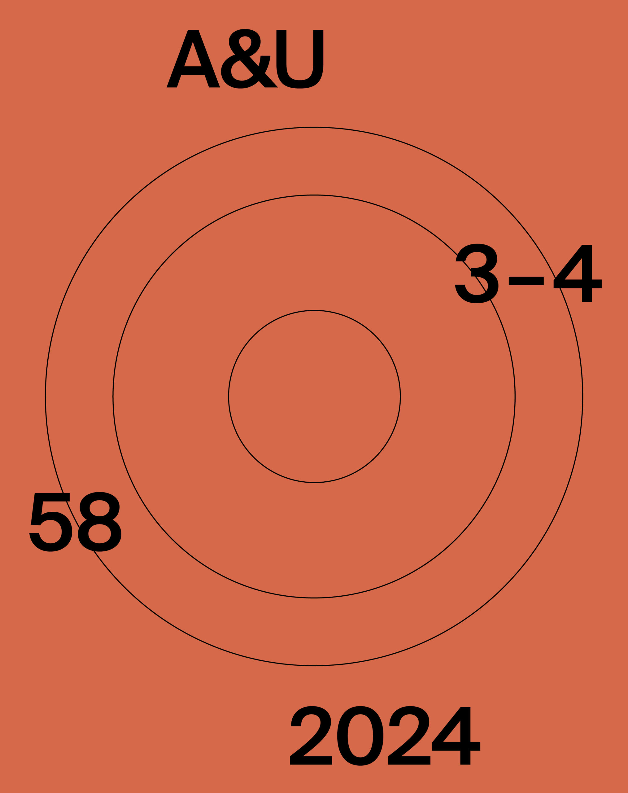
Slovak artists Tatiana Križanová Lizoň. Its square format and strikingly coloured cover, with the area occupied by the initials “a” and “u” in lower-case form, were a characteristic product of the Sixties. The hypertrophied icon ‘au’, layered one above the other, remained the recognisable logo of the journal for over twenty years. A change in layout only occurred in 1991, with the new graphic format and the journal logo, now in the form of a stylised ‘A&U’, designed by architect Peter Moravčík. While the actual logo then persisted up until 2015, the cover design and internal typographic organisation changed twice in the intervening years: in 1993 in the design of graphic designer Jany
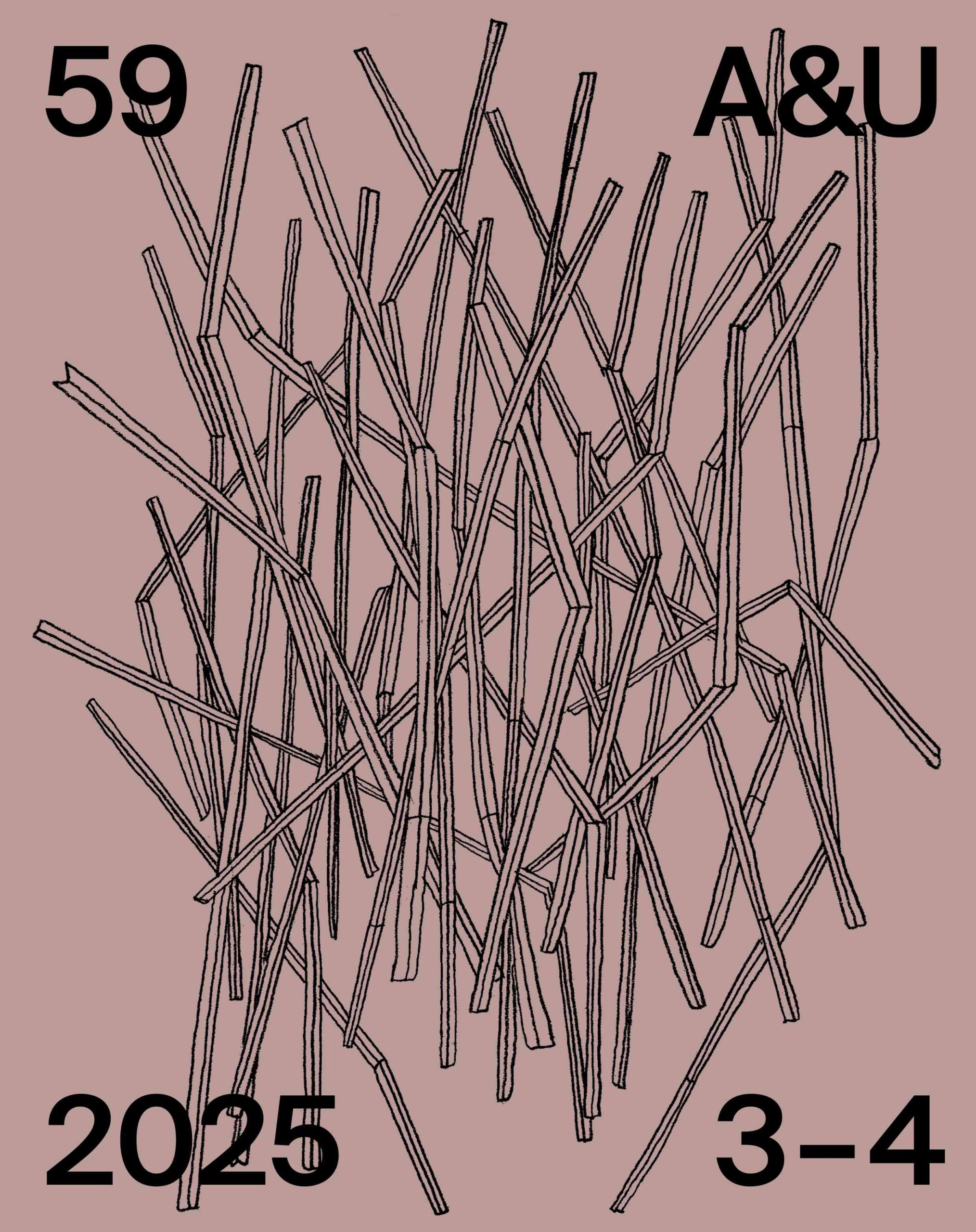
Sapáková and in 2009 from the plan of art historian Peter Szalay. As such, the design of the journal closely re ected not only its internal dynamics, but also broader social circumstances. And the tradition of high artistic cultivation in the journal has continued up to today, to our reflections on how to visualise its fiftieth anniversary issue. As a result, for the first time in the history of A&U, its form has become the subject of an artistic competition. This competition took place in two rounds in late 2014 and early 2015, and attracted several leading representatives of Slovak design: Juraj Blaško, Anna Jablonowska-Holy, Matúš Lelovský, Peter Liška, Boris Meluš and Ľubica Segečová.
The jurors, Marcel Benčík, Ľubica Hustá, Henrieta Moravčíková, Mária Rišková and Peter Szalay, eventually entrusted the design of the journal to the hands of designer and instructor at the Bratislava Academy of Applied Arts Juraj Blaško. Hence the journal will now appear in a new form, one continuing the high visual level of the periodical, developing its potential, and while retaining continuity with the past moving the publication itself visually into the 21st century.
Šesťdesiate roky minulého storočia boli pre československé kultúrne a intelektuálne prostredie mimoriadne priaznivé. V tom období sa zrodilo množstvo pozoruhodných iniciatív vo všetkých oblastiach spoločenského života. Výnimkou nebolo ani prostredie vedy. Dobový entuziazmus, rozvoj nových smerov bádania a snaha prezentovať dosiahnuté výsledky na najvyššej úrovni sa premietli aj do založenia prvého vedeckého časopisu v odbore architektúra a urbanizmus v Československu. Architektúra & urbanizmus, časopis pre teóriu architektúry a urbanizmu vznikol v roku 1967 na pôde Ústavu stavebníctva a architektúry SAV v Bratislave v spolupráci s Kabinetom teorie architektury a tvorby životního prostředí Československej akademie věd v Prahe. V čase svojho vzniku však nebolo toto periodikum pozoruhodné len svojím obsahom, ale aj formou. Autorkou pôvodného grafického návrhu časopisu bola slovenská výtvarníčka Tatiana Križanová Lizoň. Štvorcový formát a obálka výraznej farebnosti, ktorej plochu vypĺňali začiatočné písmená časopisu v minuskulách boli charakteristickým produktom šesťdesiatych rokov. Hypertrofované malé písmená au zoradené jedno pod druhým sa stali poznávacím znamením časopisu na vyše 20 rokov. K zmene layoutu došlo až v roku 1991. Novú grafickú úpravu a logo časopisu v podobe štylizovaného A&U navrhol
architekt Peter Moravčík. Zatiaľ čo poznávacia značka časopisu pretrvala bez zmeny až do roku 2015, podoba obálky aj vnútorného zalomenia sa v nasledujúcich rokoch zmenila hneď dvakrát. V roku 1993 podľa návrhu grafickej dizajnérky Jany Sapákovej a v roku 2009 podľa návrhu historika umenia Petra Szalaya. Grafická podoba časopisu tak dokonale odrážala nielen jeho vnútornú dynamiku ale aj širšie spoločenské okolnosti. Tradíciu vysokej výtvarnej kultúry časopisu sme sledovali aj vtedy, keď sme uvažovali o tom, ako vizualizovať jeho päťdesiaty ročník. Podoba časopisu sa preto prvý krát v jeho histórii stala predmetom výtvarnej súťaže. Súťaž prebehla v dvoch kolách na prelome
rokov 2014 a 2015. Zúčastnili sa jej poprední predstavitelia a predstaviteľky slovenského dizajnu Juraj Blaško, Anna Jablonowska-Holy, Matúš Lelovský, Peter Liška, Boris Meluš a Ľubica Segečová. Porota v zložení Marcel Benčík, Ľubica Hustá, Henrieta Moravčíková, Mária Rišková a Peter Szalay nakoniec zverila grafickú stránku časopisu do rúk dizajnéra a pedagóga Vysokej školy výtvarných umení Juraja Blaška. Časopis tak vychádza v novej podobe, ktorá nadväzuje na vysokú výtvarnú kultúru tohto periodika, rozvíja jeho potenciál a pri zachovaní kontinuity s minulosťou posúva časopis aj vizuálne do 21. storočia.

This work is licensed under a Creative Commons Attribution 4.0 International License